FEATURE30 September 2019
Sir David Spiegelhalter in seven
x Sponsored content on Research Live and in Impact magazine is editorially independent.
Find out more about advertising and sponsorship.
FEATURE30 September 2019
x Sponsored content on Research Live and in Impact magazine is editorially independent.
Find out more about advertising and sponsorship.
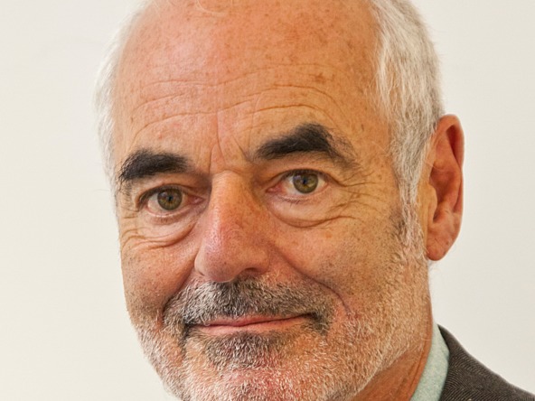
Professor Sir David Spiegelhalter is the Winton professor for the public understanding of risk at the University of Cambridge, associate fellow of the Centre for Science and Policy, and author of several books. His most recent is The Art of Statistics.

Good research has shown that relative risks – such as some food increasing a cancer risk by 20% – produces an exaggerated impression of the importance of risk. So it’s the researchers’ and media’s fault if they are poorly understood, as audiences are not being told the crucial factor: 20% of what? Without knowing the baseline risk, relative risk is impossible to interpret. On principle, I try to ignore every story that mentions ‘an increased risk’ – except as an example to criticise.
I have a high regard for most health and science journalists. I believe – and this is backed up by research on press releases – that researchers and press offices are as much to blame as the media when it comes to exaggerated risk stories. And, of course, the sub-editors add clickbait headlines.
School mathematics is derived from a 19th-century model of what should be taught and makes little attempt to teach useful skills. We need to teach far more about data science and data literacy, but this does not necessarily belong in the maths curriculum. Unfortunately, the English education system is based on subject silos, so cross-disciplinary skills get sidelined. Core Maths is a step in the right direction, but teachers need a lot of support, and materials need to be carefully developed and evaluated.
Good old-fashioned face-to-face surveys, based on probability sampling, are still the gold standard, but are increasingly expensive – and people are less willing to participate. Panels are cheaper and more efficient, but are self-selected and they only have to do online responses. However, more sophisticated analytic techniques, such as multi-level regression and post-stratification (MRP), show promise in improving accuracy.
Perhaps the work on performance comparison and in healthcare: I am delighted when I see funnel plots and cusums [cumulative sum control charts] being used. I did not invent these techniques, but – inspired by our work on the public inquiries into Bristol child heart surgery and Harold Shipman – I worked on their wider dissemination.
I love good visualisations – just think of what Hans Rosling, the Swedish academic and statistician, was able to achieve. They must be a good thing, but need responsible use, so as not to mislead people.
There was a time when some in the statistical community viewed the rise of data science as a threat, because some commentators seemed to think bucket-loads of data would mean the ideas from statistical science were no longer necessary. As I argue in my recent book, The Art of Statistics, this is a complete delusion.
The more data there is – and the more diverse the applications – the more important become basic ideas of data quality, bias, model adequacy, uncertainty and so on. This is being recognised, and I look forward to a time when it is accepted that data science and statistics are fields with huge overlap – but one is not a subset of the other.
0 Comments